
Background
One of the most valuable assets a person can possess is often the property they live in. However, in order to access the wealth tied up in their property, the owner has to sell their property which can be a cumbersome and time-consuming process. Additionally, this means the property owner has to give up their home, which can be emotionally difficult and disruptive to their life.
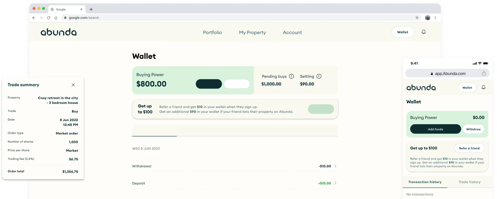
This was exactly the gap in the market Abunda's founders identified. Their mission was to help property owners unlock the equity in their homes by connecting property owners with interested investors, thereby allowing owners to continue living in their homes. Initially, Abunda partnered with our studio to conduct research and help craft their MVP to pitch to investors and go to market with. A small but pivotal aspect of this project was to empower users to effortlessly access and manage their personal funds within the platform.
The Problem
My main challenge was to design a seamless, and secure way for users to access and store funds within the app. Without this functionality, users would be unable to trade on the platform, hindering Abunda's ability to deliver on its core purpose–trading property equity. Therefore we needed to design a user friendly solution that could integrate with the existing architecture and offer a smooth and reliable user experience.
Without a safe and easy way to access personal funds trading would be impossible on the platform.
Understanding the Technical Requirements
To create a seamless and secure fund management feature for the property trading app, I liaised with the client to understand the tech feasibility and any limitations to consider. This was to ensure that we didn't waste time on a solution that was not possible. From this I discovered that it would not be possible to integrate with a bank from day 1 therefore we would need to consider alternative options that would still offer a seamless experience.
Importantly the Abunda team wanted the experience to be mobile first so that users could easily trade on the platform whenever, and wherever they were. We therefore concentrated on designing for mobile as a first priority before moving to desktop.
Proto Personas
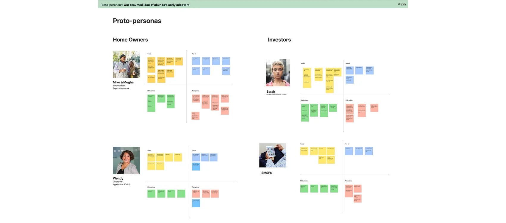
To empathise with our users more, we created proto personas across the different early adopters separated by age group. This revealed that at the heart of it users needed to trust that Abunda could securely maintain their funds, as homeowners would be entrusting Abunda with their nest egg (which was their home), and investors would be entrusting Abunda with a significant amount of funds.
Insights from Potential Investors
Through our user interviews for the core product we uncovered that investors and homeowners were regular users of online trading and crypto platforms. We also discovered that there was some anxiety over the Abunda solution as it was unfamiliar territory.
Therefore we could leverage some of the patterns found on these platforms in our designs to help ease some of these anxieties.
Analysing the Competition
Armed with these insights I analysed indirect competitors in the trading space, including Stake, Sharesies, Spaceship, and Pearler to uncover possible solutions. Through this analysis, I identified a few ways that platforms manage funds. These include:
- Using a wallet feature which directly integrates with a users bank. This approach would not be possible in the MVP for this platform.
- A manual transfer method - where users have to manually transfer funds from their bank account each time they want to make a trade. This approach would require a more complex user flow and could potentially result in longer processing times for users.
- Leveraging a third-party payment processing service, such as PayPal or Stripe, to handle transactions on the platform. However, this would require users to create accounts with those services and could result in additional fees for both the platform and its users.




Crystallising Our Findings
From our research we concluded that a manual transfer method would be our best option for the MVP for the following reasons:
- This option is technically feasible and quick to implement, allowing Abunda to launch their product into the market faster.
- Users are familiar with this pattern due to their use of trading apps, therefore the friction introduced from manually transferring funds is less of a hindrance to their user experience.
- This is preferable to using a third party payment processing platform as there are no additional fees and no requirements to create additional accounts.
- Security is more easily implemented and controlled by the user through 2 factor authentication which gives the user confidence that they have full control over their finances.
Brainstorming a Solution
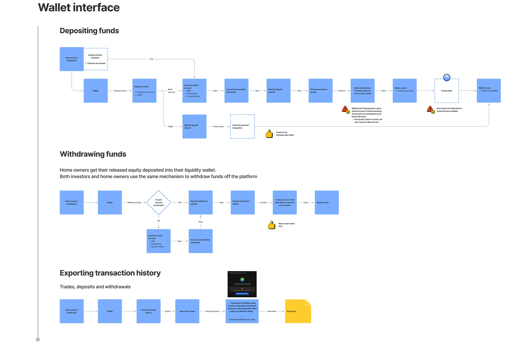
To get a full picture of the wallet and all the interactions involved I created a user flow. This allowed us to determine what additional technical requirements we needed to design for and revealed gaps in our knowledge of how it would work.
Fleshing Out the Solution
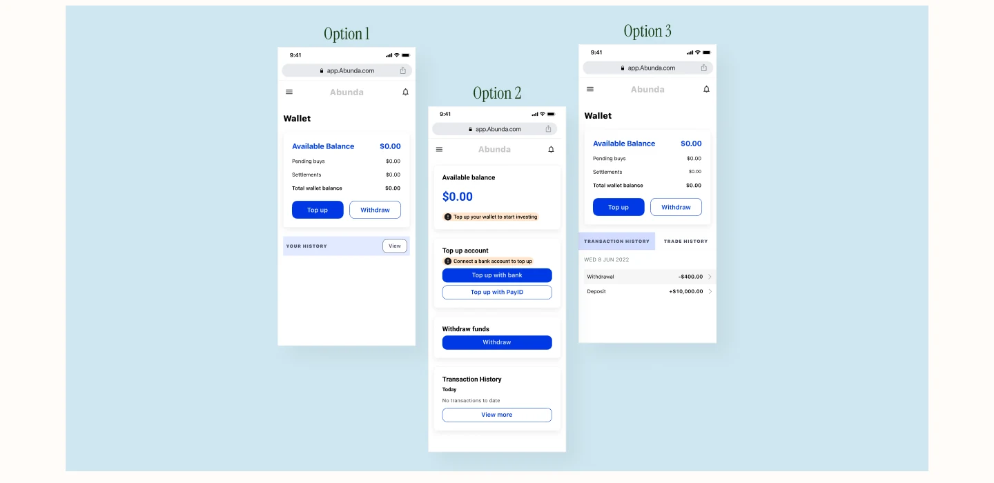
Once approved by the client I started creating wireframes for the wallet. When using the wallet the investor user would need to understand at a glance how much available funds they had in their account, and what actions they could take. When first using the product they would also need to be encouraged to connect their account.
With these in mind I created a few lo-fi wireframes of the wallet dashboard to explore how we could achieve this on the dashboard. We decided showing everything upfront on the dashboard would be important for users as it allows them to get a quick overview of their funds at a glance.
High Fidelity Designs
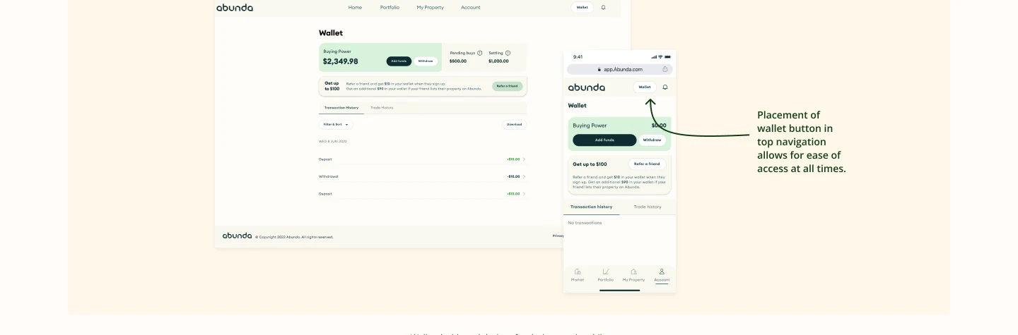
We decided that the Wallet needed to be easily discoverable by users throughout the platform. While we initially considered having this placed within the bottom navigation, since there were already many navigation items here we decided to utilise the top header.
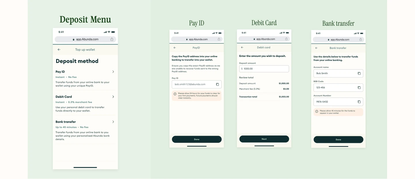
Deposit Flow
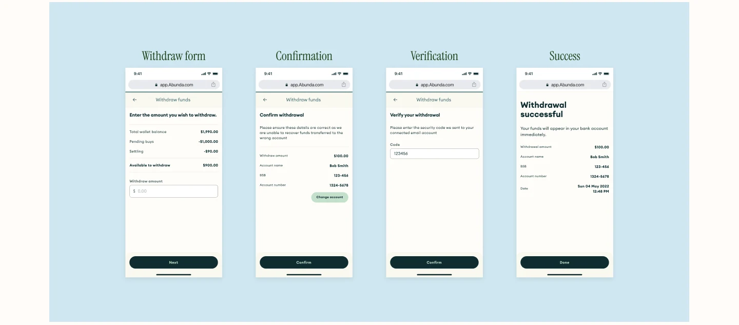
Withdraw Flow
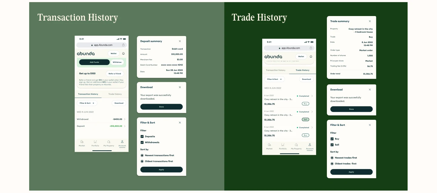
Transaction and Trade History
By keeping Transaction and Trade History on the Wallet dashboard we were able to reduce complexity and to allow a user to gain a full picture of their financial state at a glance.
Results & Takeaways
Designing the wallet for the property trading app was a critical aspect of the project as it enabled users to deposit and withdraw funds seamlessly. By implementing this feature, users are now able to keep track of their finances and execute trades without any hitches. This resulted in a significant improvement in the product's usability as without the ability to place funds into their account the platform would be unusable.
In future some ways I would test this feature are:
- User analytics to track user behaviour (such as Google Analytics or Amplitude). This would be my first line of testing to help identify if there is any potential issues and areas that need further investigation. I would also use this to assess which of the current methods to deposit money are least popular. Doing so would allow us to introduce alternative ways to deposit money for users.
- Feedback surveys. I would also periodically ask users to give feedback about their experience to gain valuable qualitative data about possible areas for improvement.
- Usability Testing. By observing users as they try to complete tasks related to the wallet it would help us identify any usability issues or roadblocks that users may face while using the wallet.