
The Problem
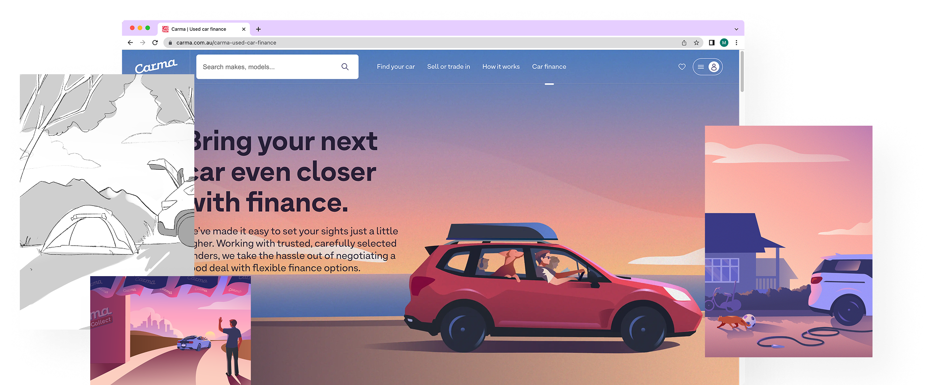
In an industry where second hand car dealerships are seen negatively, Carma needed to break away from the stereotype.
They needed something that would elevate their brand and push the boundaries of how their customers viewed their brand. Being fully digital this would require a shift in the way they marketed themselves on their landing pages.
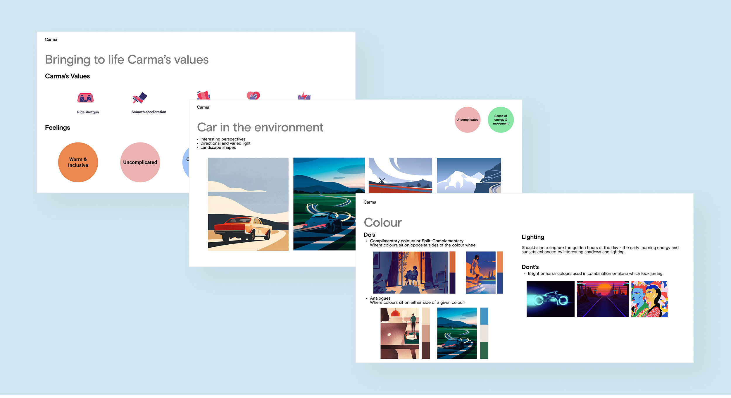
Stage 1: The Styleguide
An important starting point for us was setting up the rules for Carma's illustration style. These we decided would be governed by their company values, we focused on how they translated to the feelings we wanted the audience to feel. We created mood boards to help the client understand the direction and vision we wanted to capture. Key areas covered in our guidelines were composition, subjects, colour, and general do's and don'ts for illustrations.
Stage 2: Planning
The first step when creating the illustrations was to define the concept we wanted to convey in an illustration and once agreed on by the team at Carma I created quick sketches of the illustration to determine the best layout.
.DxWgryOR.png)
Stage 3: The Final Illustration
Once the team were all in alignment and were happy with the illustration I moved these into Adobe Illustrator and converted them into final illustrations. I would test these illustrations on the webpages to ensure that the illustrations worked responsively and with text overlaid.
Results & Takeaways
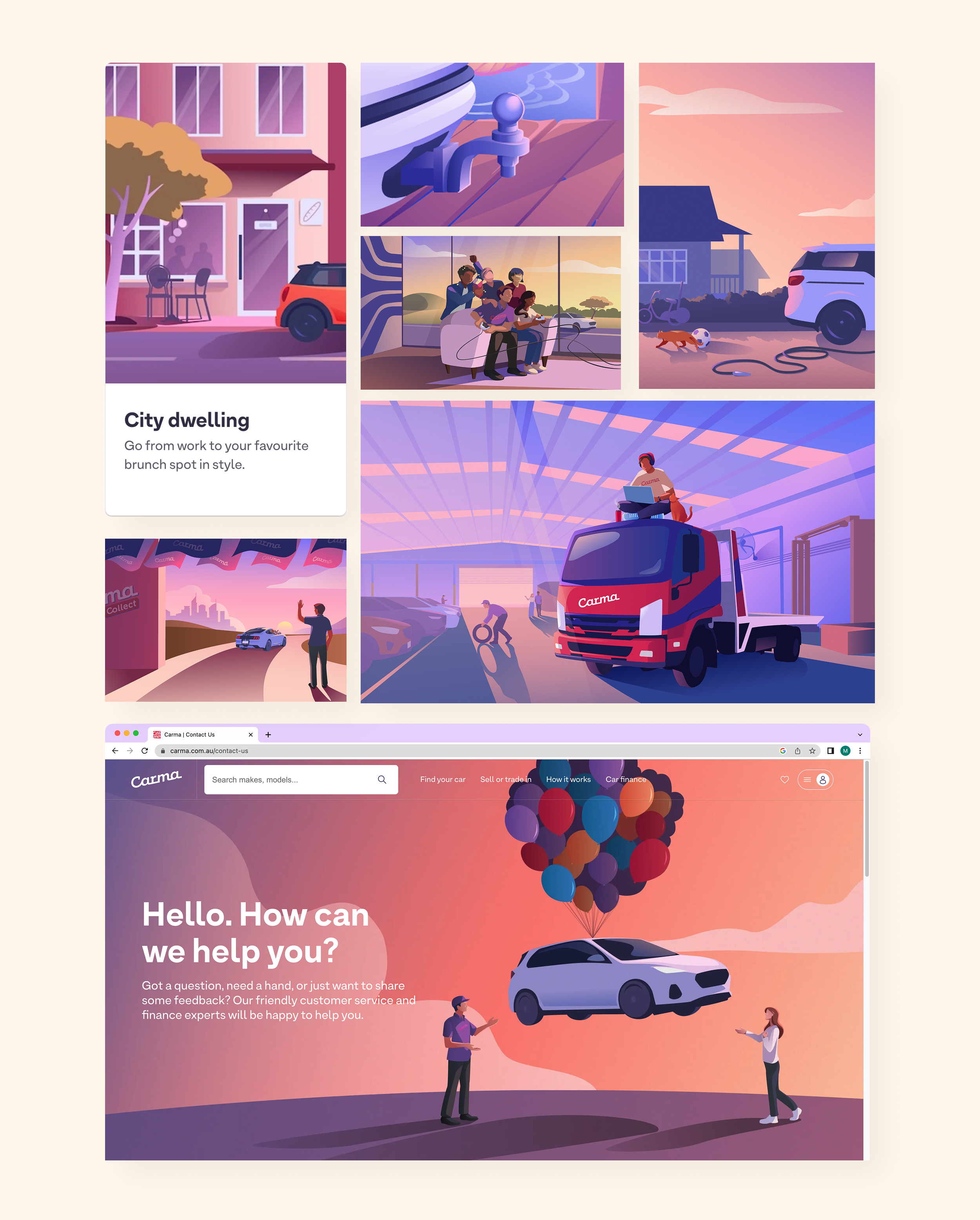
Once implemented the new illustrations were received positively by the team at Carma and their audience. Our success on the initial brief led to more requested illustrations to be used across the website from cards to icons and internally such as on staff material and shirts.
Some key takeaways for me personally were:
- Illustration style guides are crucial for maintaining consistency and clear visual direction.
- Successful illustrations are effective at transporting the audience into the scene and forging a connection between the brand and their customers.