
Background
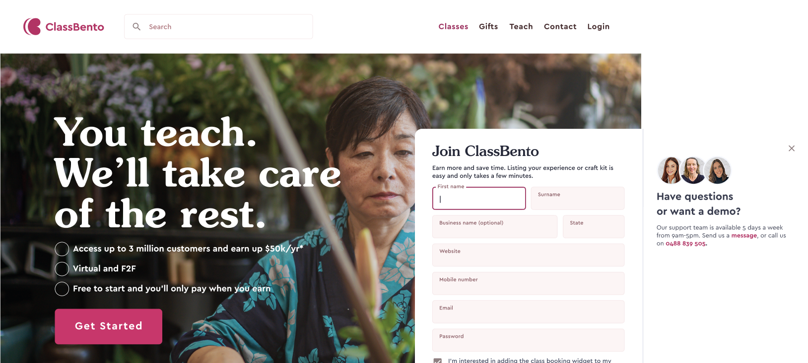
ClassBento is a platform that hosts online and in-person workshops for creative hobbies, based in Sydney. Over the years they have grown from a small start up serving the hobby community in Australia to having branches in the USA and UK. However, having no time to maintain their marketing pages, they came to us for help redesigning their Teach landing page, which had over the years become bloated with content and lacking a clear message.

The Problem
Despite prospective teachers viewing the teach page, they were failing to convert to sign ups through this funnel. This was a critical problem because the primary goal of the teach page was to encourage teacher sign ups, without which there would be limited classes offered on the platform. The page was failing in its primary goal and increasing the burden of sign ups on other areas of the business.
The landing page was failing in its primary goal and increasing the burden of sign ups on other areas of the business.
...I started teaching so I could share my love for watercolouring. However I ended up spending more and more time on promoting myself, and admin fees...
Understanding the Problem
We wanted to speak to teachers to better understand this problem. However, with access to only a handful of teachers and little time to talk to them all, we instead turned to ClassBento's 2 Business Development Managers. To date they were the main driving force in transforming leads into sign ups and talked to teachers every day, so they had a deep understanding of the teachers' pain points, wants and needs.
Through the interviews I discovered that the teach page was not used as part of the business development managers' sales pitch, as it was overloaded with content and hard to navigate. Instead they were using their own materials, which connected to the teachers' 4 key concerns:
- Personal connection with the brand and its founders' stories.
- Pain points because teachers wanted to spend less time on admin and marketing.
- Point of difference in the support given to teachers and the low fees compared to competitors.
- Transparency and simplicity around pricing, because it strongly influenced their sign-up decision.
Taking Stock of the Current State
I then conducted a content audit of the current site to assess whether each content block addressed the 4 key areas teachers thought influential to their decision. This way I could identify which information was important to keep or discard to improve the overall experience of the page.
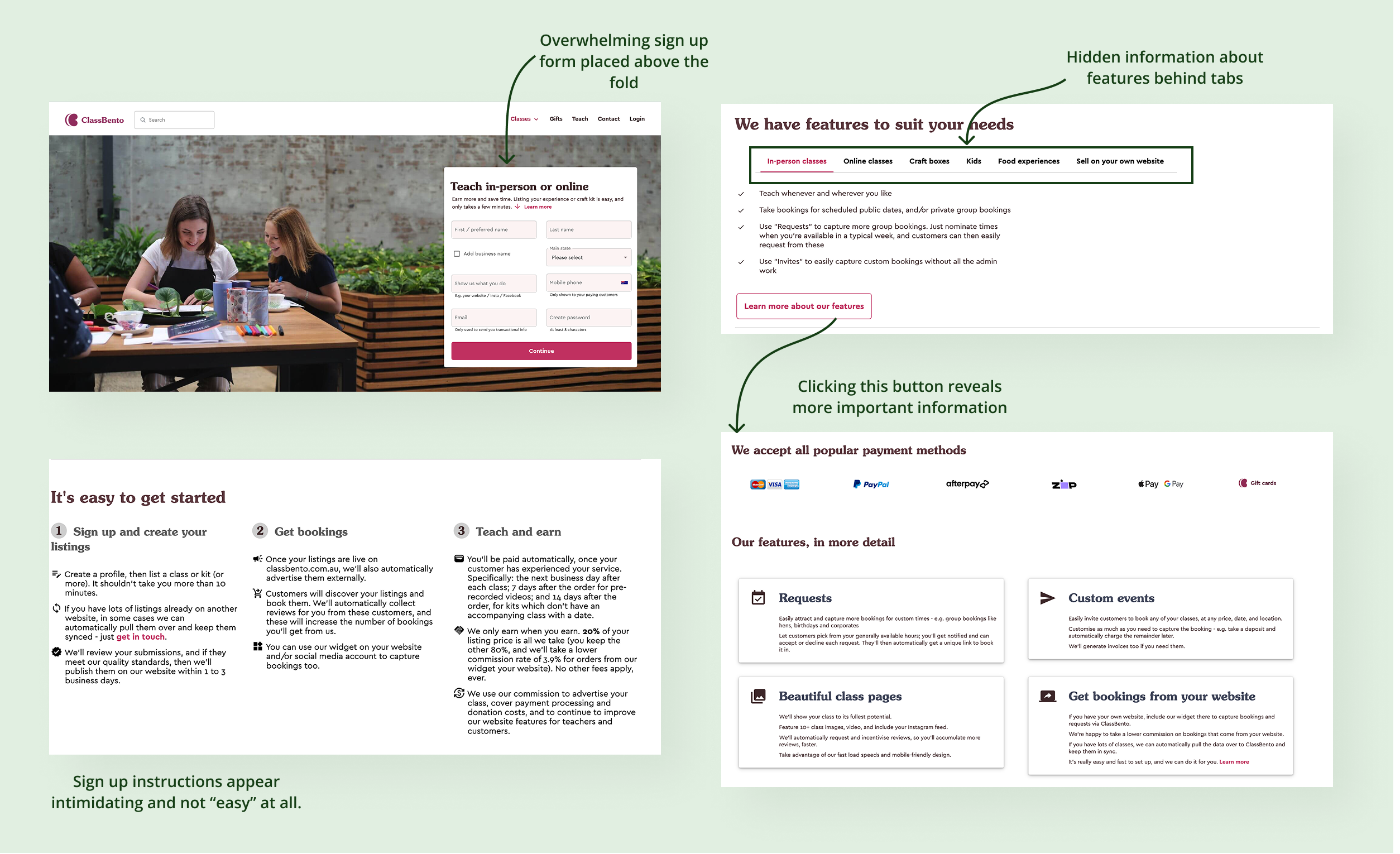
From this I discovered 3 key problems:
- Overwhelming content on the landing page. The volume of information was overwhelming and often repetitive or hidden behind tabs, which puts the work on teachers to dig for the information they want.
- Unclear messaging about how ClassBento solves the teachers' core problem. This missed a key opportunity to connect with teachers and build trust.
- The booking system was not explained. This was a missed opportunity to sell a feature the client also wanted to grow.
Creating a Structure
We created a new content structure for the page that we all agreed on. As we had a tight timeline, having a strong direction was imperative so that we could jump straight to hi-fidelity designs. The aim of the new structure was to strike a balance between providing enough unique information to teachers whilst not overwhelming the user.
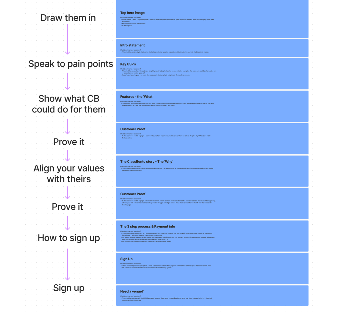
During this phase we also explored the information architecture of ClassBento's pages, focusing on where the booking system page should live. This was for SEO reasons - a well defined information architecture makes it easier for search engines to understand the structure of a website and serve up popular pages as sitelinks.
The 2 options considered included:
- Option 1
- The current structure (where booking system is a subpage off the main landing page).
- Option 2
- A new structure (where the booking system is a subpage of the Teach landing page).
We decided the current structure was the best option because:
- It is a flatter site architecture. This is better for SEO as it reduces the number of clicks from the home page to the booking page and conforms to the three-click rule. The benefit of this is that it is more likely to feature as a site-link on Google, encouraging discoverability. This is important because the client wanted an increase in sign ups for their booking widget.
- It encourages discoverability throughout the site. Since it lives in the navigation which also increases the chances of a user finding it when using the website.
Designing the Solution
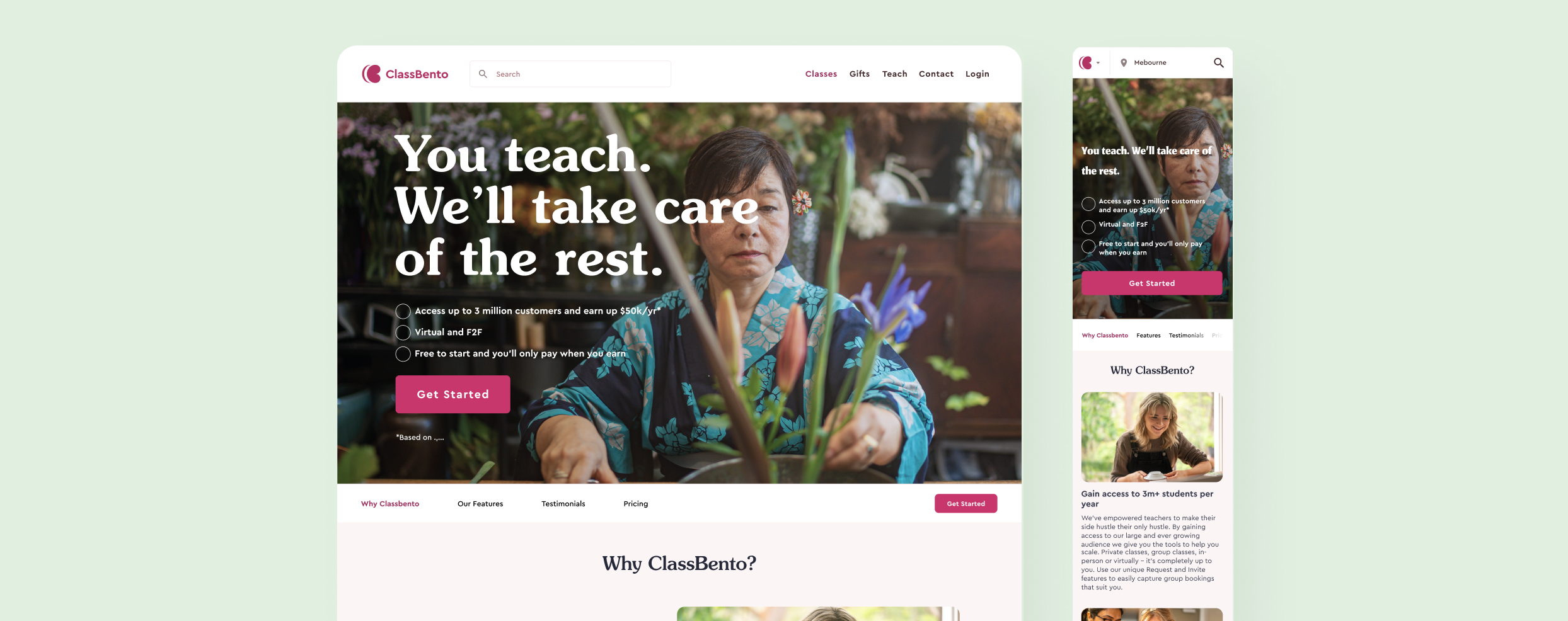
The final designs promote a cleaner, more structured landing page and rethought how to show the content without overwhelming the user. We used ClassBento's existing design system to stay consistent with their brand, while looking for ways to push it to a fresher, more updated look.
Sign up form modal
Instead of having the sign up form embedded on the page from the start, we moved it into a modal triggered by “Get Started”. This reduced the initial cognitive load and let users absorb the value of the page first, while still keeping the sign up flow prominent and easy to reach.
.BS7CwN_N.png)
Cross promotion of widget
The booking widget was another key feature the client wanted to grow, so the landing page needed to pull double duty. By surfacing it here, we could strengthen the teacher sign-up funnel while also introducing another ClassBento product with a clear and relevant benefit.
.DEoOmN71.png)
Addition of Pricing
From our initial research we knew that users were driven by how cost effective ClassBento was in comparison to their competitors. Therefore I included a section related to pricing to highlight the low commission ClassBento takes and sells the benefits of using their platform. I also included a dynamic calculator that shows a user how much estimated income they could receive from using ClassBento.
.D4bQ50p4.png)
Results & Takeaways
To validate the redesign I conducted 4 qualitative usability tests with teachers to gather feedback. These sessions revealed that the new page was highly relevant to the information needs of the teachers. Users felt the new structure and cleaner layout was easier to read and gain valuable knowledge from.
The key lesson I learned from this project was:
- The importance of communicating clearly with your audience. This includes the importance of keeping a clear vision for what message you want a user to gain from a webpage. The client had lost sight of this over the years due to lack of resources and losing touch with their primary users. Keeping the user firmly in mind as a company grows is essential for ensuring that the landing page effectively targets the core user group.